Wednesday, October 26, 2011
The Upturned Stone
Couldn't do it...
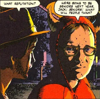
I had all 64 pages of this modern day classic scanned and ready to go online. I knew as soon as I saw those nine pages in Brian Cronin's "The Scariest Comic Books of All Time" on CBR that this was one of the all-time greats. It belongs without a doubt in the Top 10. I bought a copy on eBay the day I saw those nine pages...
But it's also creator owned.
And we must support creators, especially amazing creators like Scott Hampton.
And did you know Heavy Metal sells back issues?...
Eight bucks and shipping. That's what it costs to get your copy.
Sixty-four pages for eight bucks and some extra Heavy Metal contributions thrown in.
So take a gander and decide if you're willing to spend eight bucks.
Friday, October 21, 2011
The Digital Age - Part 2
Perhaps you don't know this, but porn hubs are some of the best categorized and searchable sites on the Internet. You can search by keyword, fetish, file type, duration, rating etc... They link into one another, are optimized for search engines, streamlined for speed and advertise like crazy. Sure there are those annoying popups and java scripts, but don't kid yourself. A lot of programmers have spent a lot of time putting these things together.
What does this have to do with comics?
There are many parallels:
Free Internet Porn. There is a lot of free porn online.
Pretty much all of it is in copyright violation or by amateurs.
Free Internet Comics. There are a lot of scanned comics online.
Pretty much all of it is in copyright violation or by amateurs.
Pay Sites. Porn wants your money. Subscribe.
Pay Sites. Comic companies want your money. Subscribe.
Porn Collectors. Some people collect porn. They won't admit it.
Comic Collectors. Some people collect comics. They won't admit how much this obsession costs them.
Big Business. Porn is a multi-billion dollar industry.
The Comic Business. Is not.
Back Catalog. Porn's been around for awhile. It has an extensive back catalog to draw from.
Back Catalog. Comics have a back catalog that makes Porn weep with envy.
OK. Imagine this:
1. Every comic ever published is now online.
2. Every online comic is broken down by writer, artist, genre, publication date, key characters etc...
3. There all available through one search engine.
4. Readers can rate the stories and comment
My God! Could you just imagine selecting a genre such as 'Horror' and search by 'Rating'? How about by 'Alex Toth'? Or '1978'?
Would you pay $9 a month for this?
I would.
Saturday, October 15, 2011
The Digital Age of Comics
1. The Golden Age (1935 to 1955) a.k.a The Good Old Days Before The Code
2. The Silver Age (1956 -1970) a.k.a. The Age of the Code
3. The Bronze Age (1971 - 1985) a.k.a The Code Relaxes and Contemplates Retirement
4. The Modern Age (1986 - 2011) a.k.a. Code Breakers and The Direct Distribution System
And now...
5. The Digital Age (2011- ...)
Oh sure, I'm aware that web comics have been around for a couple of decades now and that smaller companies have sold online versions of their comics before DC, but this is something quite revolutionary in comics. One of the big two is releasing their entire line digitally at the same time as the print version. And they're throwing in some back issues too.
I still agree with Scott McCloud (who's been right all these years).
Web comics should be different from print comics.
And isn't this simply DC putting their print comics online?
So what's new? Where's the "revolution"?
Getting readers to PAY for a digital comic.
If DC is able to establish a viable revenue stream with their digital downloads, this will begin the true age of digital comics. Innovation will come if there's a market. And prices will come down, don't worry.
Let's hope.
Monday, October 10, 2011
Brian Cronin's "The Scariest Comic Books of All-Time Archive" on CBR
I've sent mine!
http://goodcomics.comicbookresources.com/2011/10/01/the-scariest-comic-books-of-all-time-archive/
Sunday, October 9, 2011
The Vampire of Broadway
Did the move from dime store distribution to direct sales ultimately affect the content of comics?
It did. Comics went from the "Bronze Age" into "The Age of Reason" somewhere around 1982 to 1986. Continuity, story arcs, compendiums of facts, figures and abilities, not just kids stuff any more. No sir, the average fan needed to know exactly how many tons Spider-Man could lift.
But in the cheap bins still live issues like "House of Secrets" 144, another title pushed aside by the Age of Comic Book Reason. One day the publishers will put all these back issues online for public viewing. Until that day, we have the cheap bins :)
Monday, May 9, 2011
Also one of my mostest favorite Tom Sutton stories too:
http://grantbridgestreet.blogspot.com/2011/05/weirdest-character-ive-ever-known-by.html
Sunday, April 24, 2011
The Patience of a Cat
I'm sure you've all heard of 'Six Degrees of Kevin Bacon' where almost anyone who has worked in Hollywood can be linked to Kevin Bacon in six steps, or less. It's even easier for comic book characters... Really. |
But could we link up Jughead with the 'not-so-nice' blonde bombshell (and transsexual) Dagmar Laine from Howard Chaykin's "Black Kiss" in less than 6 steps?
Jughead Jones is owned by Archie Comics Publications Inc. In April 1974, Howard Chaykin drew 'The Patience of a Cat' for Archie Comics under its 'Red Circle Imprint'. Howard Chaykin wrote and drew 'Black Kiss'. That's right, three steps!
And speaking of 'Six Degrees of Separation', I truly believe that Gray Morrow is one of those industry greats whom you could link anyone in comics to in less than six steps. Gray edited and drew the cover for our next submission. And don't even get me started about Carol Seuling, who could be linked to just about anyone in comics through her late husband Phil Seuling.
“The Patience of a Cat”
Originally Published: “Red Circle Sorcery” # 6, Archie Comics Publications Inc. (Red Circle Imprint), Apr 1974
Script: Carol Seuling
Pencils: Howard Chaykin
Inks: Howard Chaykin
Colors/Letters: ?
Editor: Gray Morrow
Cover Art to ‘Red Circle Sorcery’ #6: Gray Morrow
Greater Comics Database Link: http://www.comics.org/issue/27288/
This story really got me thinking about the role of hubris in the modern horror archetype. I could postulate that the modern horror story (especially in comics) is either:
1. The Revenge Tragedy (The Guilty Are Punished, Good is Avenged)
2. The Averted Tragedy (The Good Triumph and Tragedy Passes)
3. The Black Tragedy (The Bad Triumph)
In a Revenge Tragedy, it's much more palatable to see revenge carried out against someone guilty of the crime of hubris. The more heinous the crimes, the more horrific the punishment. Horror is, if nothing else, an eye for an eye, a fang for a tooth...
Monday, March 28, 2011
Spellbound by Sturges and Kaluta
“Spellbound”
Originally Published: “House of Mystery" (2008 series) issue 20, DC Comics, Vertigo imprint Feb 2010
Script: Matthew Sturges
Pencils: Michael Wm. Kaluta
Inks: Michael Wm. Kaluta
Colors: Lee Loughridge
Letters: Todd Klein
Editor: Angela Rufino
Cover Art to ‘House of Mystery (2008)’ #20: Esao Andrews
Greater Comics Database Link: http://www.comics.org/issue/682352/
Submitted by: Harris Smith (Negative Pleasure Blog)
I have W.W. Jacobs monkey's paw under my bed.
Not the infamous short story that warns us to be careful what we wish for.
No, I have the actual genie-in-a-dead-simians-claw wrapped up in an old copy of 'House of Mystery' issue 267.
I had two wishes. It heard me.
Wish number one was that I could find a Kaluta-illustrated story that I would be comfortable plopping into my list of 'Best Horror Comic Stories Ever'.
Wish number two was that I could find a really good recent horror comic story that I would be comfortable plopping into my list of 'Best Horror Comic Stories Ever'.
And wish number three... well, we'll get to that in awhile...
I'm a HUGE 'House of Mystery' fan. When the new series came out in 2008, I ventured back into the old comic shop and happily picked up the first five issues. It was good, but well...
It wasn't as good as 'Hellblazer' (but then again, what is?). Those were the last issues I bought.
The blogosphere is a pretty cool place. I couldn't find a story that featured M.W. Kaluta to feature in my 'Best Horror Comic Stories' but maybe I could honor him with a cover. Kaluta's highly intricate and detailed style made for pretty amazing covers. It was during this search that I happened across "Spellbound" in Harris Smith's 'Negative Pleasure' blog.
I love thralls.
There, I said it. Mr. Sturges has made a great new monster archetype. That's what horror stories are y'know? An archetype with a morality lesson tossed in. A ghost story is the consequence of murder. 'Frankenstein' is scientific hubris. 'The Monkey's Paw' is being careful what you wish for. 'Little Red Riding Hood' is don't wander off into the woods with wolfish boys.
And thralls? Thralls are the siren lure to lose yourself, forget your troubles and just let go. But when you pack up your troubles in your old kit bag and smile, smile, smile, don't get too close to the Abyss. When you run too far from your worldly concerns, you enter the 'other' world. And they can make it all go away... After all, wasn't that what you wanted?
Oh, and my third wish?
Make this a movie.
I've got a monkey's paw with two fingers down, Hollywood.
Don't make me use it.
Monday, March 14, 2011
All Hallows
“All Hallows”
Originally Published: “Twisted Tales” issue 1, Pacific Comics, Nov 1982
Script: Bruce Jones
Pencils: Tim Conrad
Inks: Tim Conrad
Colors: Steve Oliff
Letters: Carrie McCarthy
Cover Art to ‘Twisted Tales’ #1: Richard Corben
Greater Comics Database Link: http://www.comics.org/issue/36856/
It wasn't supposed to be like this...
11 submissions and 3 scripted by Bruce Jones. When I started this examination of the best horror comics, I knew 'Jenifer' would be there. 'Yellow Heat' made a lot of other lists, so I felt obliged to include it for shock value alone. But "All Hallows"?
Jones does something amazing with 'All Hallows'. Oh sure, there's the 'Big Payoff' that you see coming from a mile off. No, the devil here is in the details. It's the treatment of the classic supernatural revenge tale. In 1982 Bruce Jones knew the youth of America were being desensitized to violence and pointed towards shopping malls.
God was now spelled GDP.
I'm extrapolating, but there is an eerie detachment from reality that 30 years haven't seem to fix. Maybe as Mr. Jones postulated, we are ALL HALLOW after all...
Friday, February 25, 2011
Sunday, February 13, 2011
Best Horror Comic Cover #4
When Russ Jones pitched "Creepy" to James Warren in 1964, the outcome may have been drastically different if Frank Frazetta had not been involved. Frazetta painted eight of the first ten covers of 'Creepy'. The only two he didn't do were #1 (a 'safe' cover by Jack Davis) and #8 (Gray Morrow). These are legendary covers.
I could have chosen any, but I went with the cover 'Creepy' issue #3 from 1965. Again, because it's symbolic.
It was a tough call, but this cover is the essence of horror. It is a study in contrasts. It is the sudden juxtaposition of the real with the unreal, light and dark, culture and primal fear.
A cultured, intelligent man is suddenly confronted by the forces of darkness while reading. Does this mean that by reading 'Creepy' issue 3, we too will be visited by the supernatural? This monster is framed by white light. We thought the light was there to protect us, but instead it only illuminates the horror of the thing at the door.
Wow.
'Creepy' faced a monumental task at re-establishing horror in a comic format. Like EC's 'Mad', it had used the magazine loophole to get around the Code, but was the public ready to buy it? By bringing forward the best of the best and perseverance, Warren succeeded.
And Frank, you were the best of the best.
Frank Frazetta passed away in May 2010.
R.I.P. Maestro.
Saturday, February 5, 2011
Best Horror Comic Cover #3
Published May 1976, Warren Publishing
Painting by Manuel Sanjulian
If someone made me answer what was THE greatest 10 years in the history of horror, I would have to say 1968 to 1978.
The movies... 'Night of the Living Dead' in 1968 which resurrected the horror genre, and 'Rosemary's Baby' also 1968
'The Last House on The Left' 1972,
'The Exorcist' 1973,
'Black Christmas' and 'The Texas Chainsaw Massacre' 1974,
'Jaws' 1975,
'The Omen' 1976,
'The Hills Have Eyes' 1977,
'Dawn of The Dead' and 'Halloween' both in 1978.
Something very special happened in those years. If you look at all the titles (except 'Jaws'), the bad guys are, well, more or less, HUMAN. Living human dead who feast on the flesh of the living, demonically possessed human, to crazy human. Something has happened to us and we're BAD!
Oh yeah, Woodstock happened in 1969 as well. A very transitional 10 years. The fear of those who live outside our boundaries was replaced by a fear of those who live inside them. We have seen the enemy and it is ourselves. Well, for the most part anyway. Ridley Scott's 'Alien' was 1979.
For Horror Comics, these were Fantastic years. DC's 'House of Mystery' returned to its scary themes in July 1968, captained by Joe Orlando. Its success would launch a new wave of mystery/scare titles for both of the Big Two. 'Creepy' and 'Eerie' were forerunners (due to their magazine format) with Creepy debuting in 1964. The first 'Eerie' magazine hit in 1966 and 'Vampirella' debuted in late 1969. And 1968 to 1978 were some of their best years.
Anyways, back to the cover...
You'll notice that 'Creepy' doesn't have a large logo obscuring the top third of the art. It's actually just type with the focus on the artwork. Why is that?
1. Jim Warren paid these cover artists a lot of money.
2. Magazines weren't sold in spinner racks.
There's a bit of debate as to who actually did the cover to Creepy 79, Enrich Torres or Manuel Sanjulian. Both are amazing artists. The confusion is from the fact that Torres did an alternate cover to Creepy 79 that was never used. You can see it here.
And the winner is...
Manuel Sanjulian... You are brilliant. I'm upset that there is ANY type desecrating that gorgeous cover. The tag in the upper left-hand corner should have been enough. It's Creepy, issue 79, A Warren Magazine. Stick the $1.00 price tag underneath. Boom! Instant classic.
But this is the essence of great cover.
1. Why is this attractive woman clutching a severed hand?
2. Why is she (what appears to be) a mortuary?
3. Why is there FEAR in those dark, haunting eyes... She seems to be hiding... What could she be hiding from?...
oh crap.. what if that hand?.... oh.... jeez... no...
Really fires up the dark corners of the imagination, doesn't it? Fear of the unknown. We're given the setting and the mood and the tidbit of the severed hand, but no more. Mr. Hitchcock, you have taught us well.
Next Up, I think I'll discuss a work of the late Frank Frazetta.
Monday, January 31, 2011
Best Horror Comic Cover - Part 2
But first, I wanted to talk about, well... this:
This is the cover to Harvey publications' 'Black Cat Mystery' issue 50, June 1954.
Cover artist is probably Lee Elias (although it may have been Warren Kremer).
At first glance, you probably say 'Ewww' or 'Man, they could get away with a lot before the Code came in!' It's a pretty gruesome image; a man's face and hands being melted away by a small bar of Radium. Actually, as Radium goes, that's a HUGE bar of Radium. And you'll be happy to know that even a huge bar of Radium-226 won't melt your face off at all, but radiation poisoning does exist so don't try this at home.
Where was I?
Oh yes.
The shocking cover is going to sell comics. Especially horror comics. And that is a shocking image. But do you know why it's a great cover.
Symbolism.
'Yeah, the A-Bombs won the war but now they've blown up in our face! Science has really mucked it up this time!'
1954. Nine cold years after Hiroshima and Nagasaki. Most people were led to believe that the Atomic bomb was just a really powerful bomb. It blew stuff up. Radiation was good, it made X-Rays and glow-in-the-dark numerals on your Swiss watch. Governments around the world were testing atomic bombs left, right and center. Check out Bikini Atoll for a little history lesson.
Horror is exploitative. Let's be honest. It uses sex, murder, monsters and any other headline it can wrap its talons around. So in June 1954 it was Radiation Poisoning!
One last thing...
You'll notice with all these old covers that the logo takes up the top third of the comic. That's a lot of real estate. Do you know why that is?
Take a look at the typical newsstand in 1948:
For 90% of the titles, the only thing you would see was the top third. :)
Saturday, January 29, 2011
Best Horror Comic Cover
The comic book cover is the "brand" of the comic within. The cover is sex appeal, it's a high wire act, it's art. It's the publisher's best effort to get their book into your hands.
The strange dilemma of horror... How does the appalling appeal to us? Why do we buy something that may scare or disgust us? Is there some moral lesson imparted from these tales of fright that we need to hear for our own damned good? Will it put us on the path of righteousness? Or do fictional horrors serve to allay our own bed-time fears? Or just remind us to lock the door?
Perhaps we just like a good scare. Maybe all of the above and more.
So what makes a great HORROR cover?
It really is a case-by-case basis, isn't it? Let's consider perhaps THE most notorious comic cover in history, featured in Fredric Wertham's 'Seduction of the Innocent'... Johnny Craig's cover to Crime Suspenstories #22:
We could make the argument that this is a Crime comic, although William Gaines would disagree...
Senator Estes Kefauver: "Here is your May issue. This seems to be a man with a bloody axe holding a woman's head up, which has been severed from her body. Do you think that's in good taste?
William Gaines: Yes, sir, I do...for the cover of a horror comic. A cover in bad taste, for example, might be defined as holding the head a little higher so that blood could be seen dripping from it, and moving the body over a little further so that the neck of the body could be seen to be bloody...
OK, it's a Horror comic. And damn if Johnny Craig couldn't rock a cover!
There's just something about how the center is this guy's belly and your eye has to drift for a split second to put the elements together. The bloody axe, the half-shot of the woman's body on the floor and waitasecond... is that a severed head he's holding?! Whoa!
Right off the bat, you knew what kind of comic this was. Sure it ushered in the Comics Code Authority and destroyed comics for the next 20 years in America, but... whoa.
Next Up: Creepy #79